Learning about color
Craig Elliott
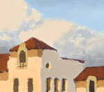
I recently commented to a friend of mine that I had painted a particular building in Pasadena many times to practice color. I was designing the Disney film Enchanted at the time and could see the top of this beautiful Old Town Pasadena building all day from my desk (the one that houses Louise's Trattoria for those of you who live there) I thought I would post these sketches for you to see how simple this kind of sketch should be when you are only concerned with understanding and learning how color behaves. I am not concerened with accurate edges or details of any kind. I just want to record the basic color and vlaue relationships that I am observing. As I collect these kinds of sketches I file them by lighting situation and reopen them and sample the colors when I am painting a film design from my imagination!
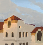
 In this sketch, the building clearly faces west on the light side as the sun is setting. The warmth of the light is caused by the sunlight having to go through more atmsphere when it is setting and losing some of the cool end of the spectrum. The cool side of the building and clouds is influenced by the sky mainly. In the case of the building, other buildings (and the ground) are also adding reflected light that is hitting the subject building.
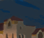
 Here, the situation is clearly a night scene with light cloud cover in the sky. The warm lights of the restaurants and shops lights the building from the bottom. This light falls off quite quickly, as the man-made lights are not that powerful. Towards the top of the building cooler moonlight mixes with the warm lights to make a sort of geenish grey light. The moonlight also colors the shadow side of the of white building's walls. One of my favorite features of the sky here is the lack of differention in the clouds in terms of value- the clouds are really just a different (greyer and greener) color than the sky.
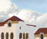
 The light side of the clouds and building in this sketch is a much more balanced and full spectrum light. You can see that the clouds are "actually" white and the building is "actaully" painted a slightly warm white. The shadow sides are lit from the dome of the sky and thusly that light is the color I have painted the sky here.
 Here is another end- of -day (or "golden hour") color sketch. In this case, another building is casting a shadow on the lower half of main building, creating a nice mood. The shadows are all much greyer in this case than they might normally becaue the sky had pretty heavy patches of grey clouds, greying out the blue light of the sky dome.